Studio Closeup #6

In this crazy journey called Life™️, the current state of the world and its terrifying unrest, I am at a point in my life where I need to find places where I remember being the happiest. That state of just being and enjoying and somehow create that same feeling in current adult life. That’s what I’ve been doing lately to keep away from the creepy dark edges of depression that really want to seep in. So I started digging deep and I’ve found a whole new world to escape into when this one is too messed up to remotely navigate in. This is how the museum series first came about because I was pretty much at the end of my tether with everything 6-8 years ago - and that was before the flood, before LuLu passing away, and before COVID.

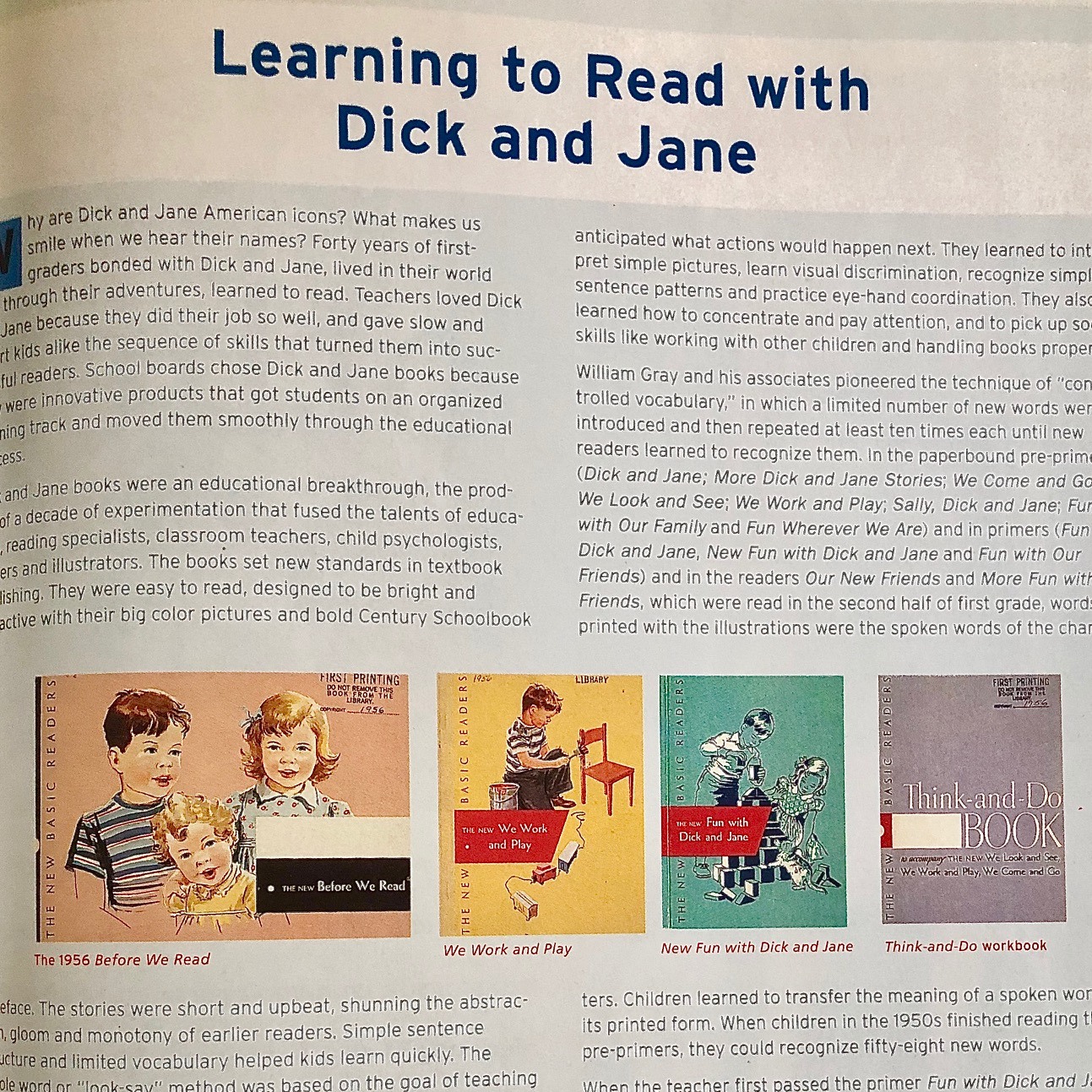
Back to finding various states of happiness. I remember the reading series I had in first grade. It was a whole series from Ginn & Company and Theodore Clymer that they put out in the 1970’s. Not only do I remember the joy of learning how to read but I also remembered the beautiful artwork inside these books. Loose gestural black lines atop colorful translucent watercolor/design marker. Even today, the detail and fluidity of these illustrations are gorgeous.

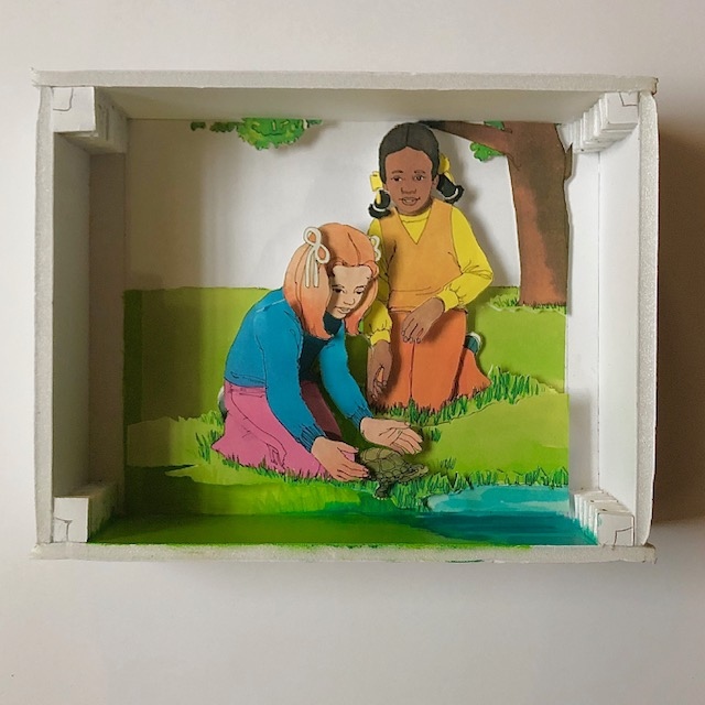
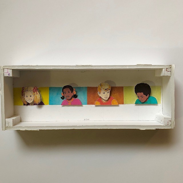
The one I recall the most was “Pocketful of Sunshine”. There was Bill, Jill and their dog Lad. They had friends that were of a different race than they were - it truly was a world of discovery for me. I loved looking at it even when I wasn’t at school. Other titles I’ve been able to track down include “A Duck Is A Duck”, “Helicopters And Gingerbread” and “Ready For Rainbows”.

So, on a whim I decided to search for these elusive things on eBay and AbeBooks to see if they even still existed which I knew was a long shot. An obscure reading curriculum from the Racine Unified School District in the 1970s. Right. But I found some! The old brochures that came with one of the teacher’s manuals shows an entire filmstrip collection set that was available at the time, but I haven’t been able to track it down yet but I’m quietly determined to find it. This is when I’m thankful for and not irritated by the internet.

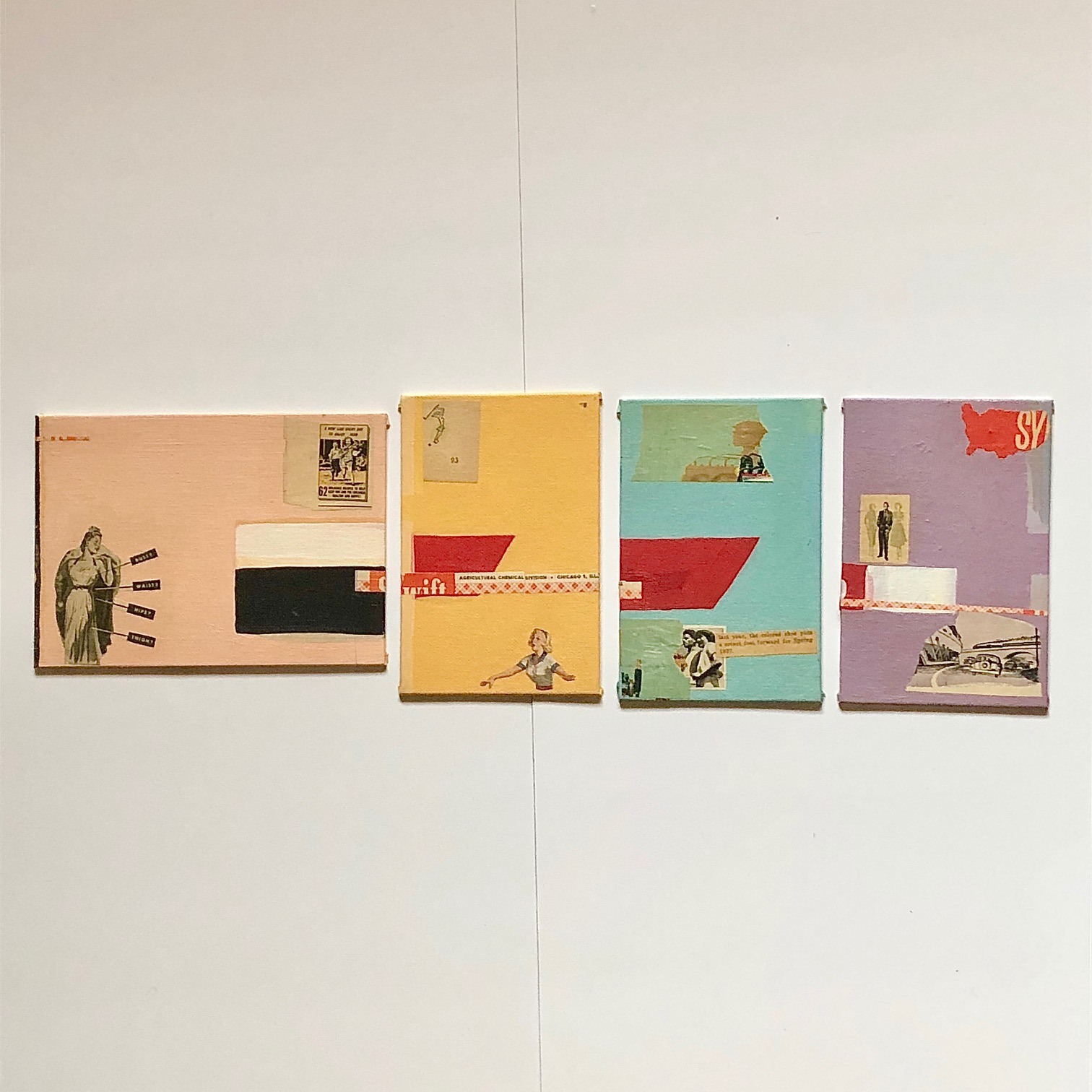
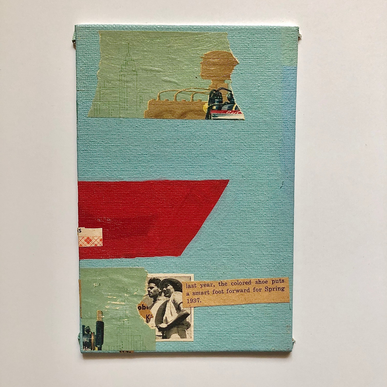
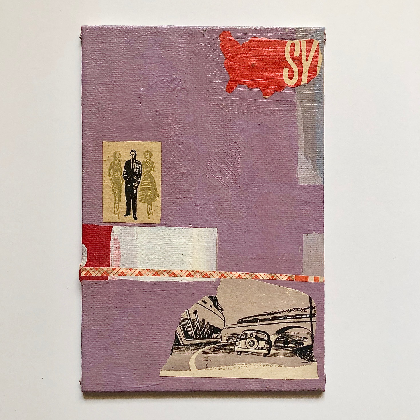
There will be more pieces in this series to come. This piece was a big battle between my heart (feeling the color combos) and my head (technique and composition). The art from the original books looks either to be watercolor or marker so I wanted to reproduce that childhood colored crepe paper translucency by making the acrylic paint do the same thing. I normally don’t think of acrylic paint as translucent so that was a big hurdle to overcome along with making it look “layered”. It’s also a throwback to vintage Sesame Street where I learned how to share, cooperate and that kids of different colors are kids just like me.

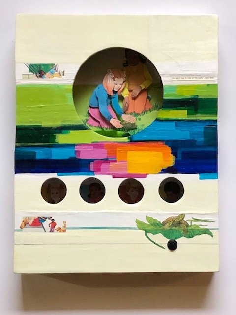
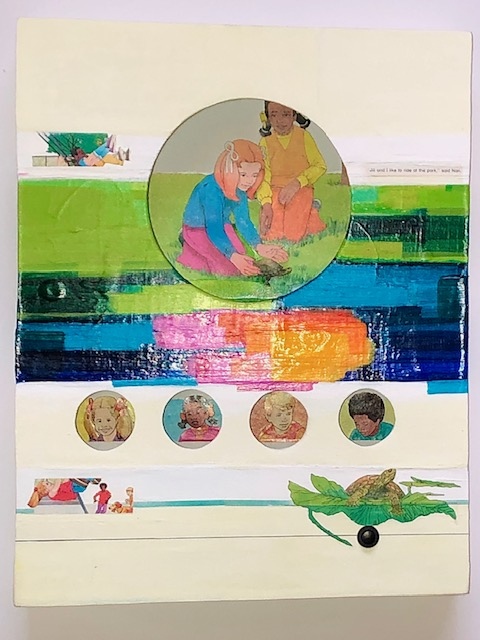
The off-white slightly yellowed top and bottom “bands” on these pieces represent the slightly yellowed pages of a book and the use of white space they used in the original illustrations that I never got over - the white space for the tiny illustrations and words to artfully make the entire page's design. The slightly yellowed bands on top and bottom are also chalky looking and feeling (gesso with a thin top coat of tempera paint) to contrast with the middle color strip that will be shiny and almost appear water-like after several layers of varnish are applied.

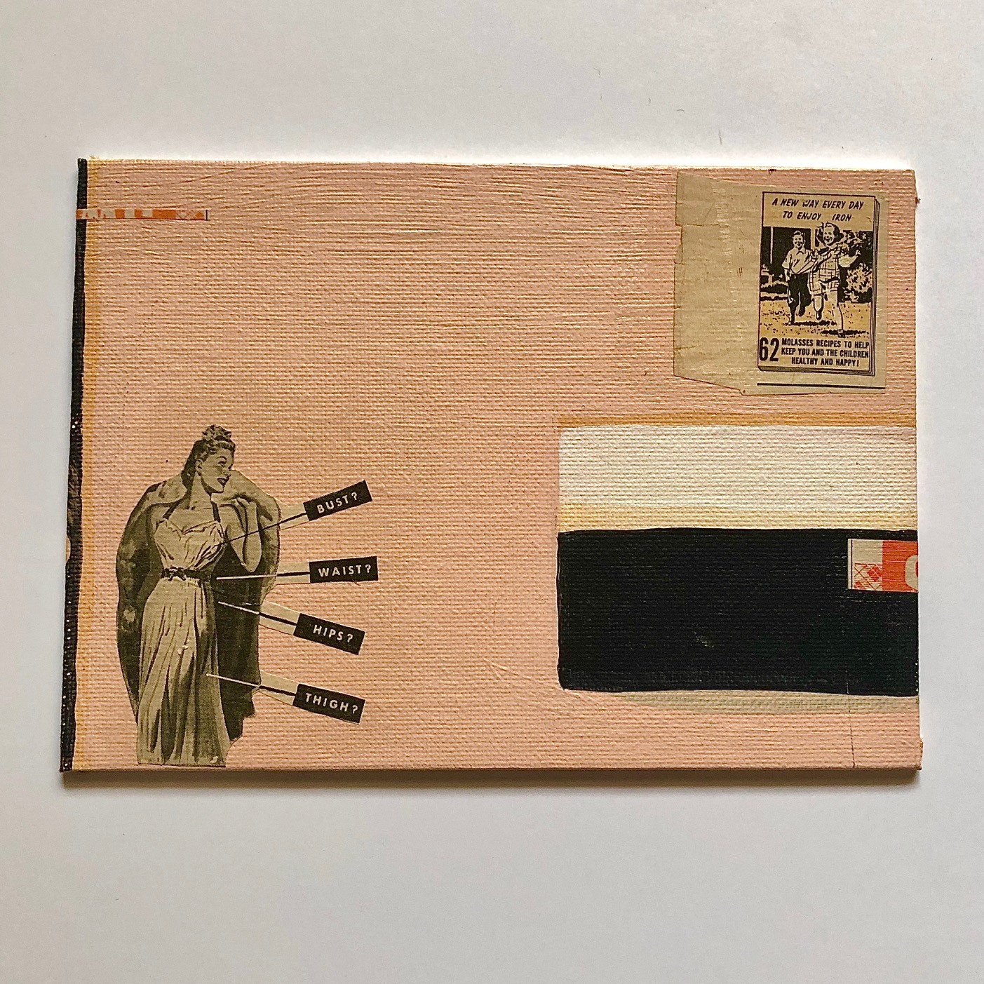
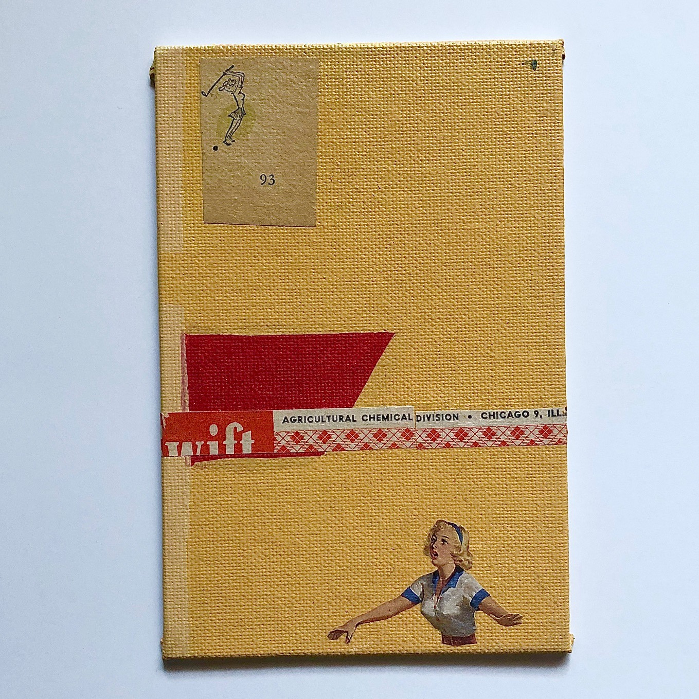
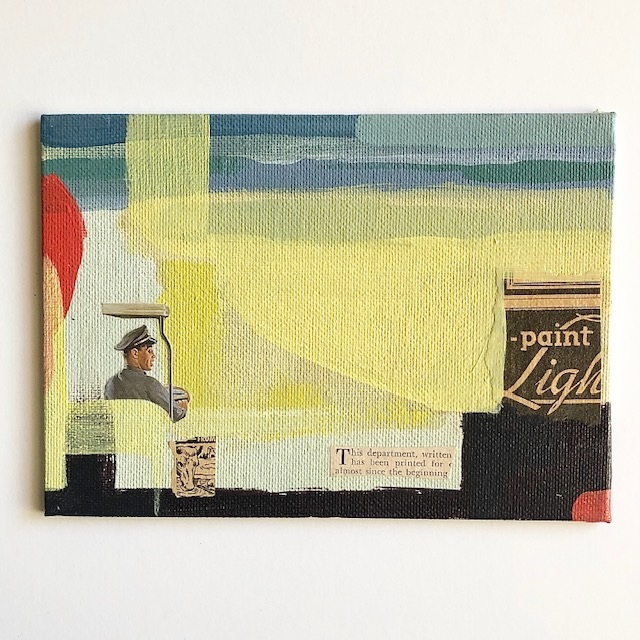
I’ll probably point this out again in the future but all these dioramas inside these pieces will have interior lighting added as well. The black button is the power source when pressed. But for now, I’ll keep including closeups of what’s going on inside the painted piece separately here on my blog. The dioramas themselves are illustrations cut from the original books. The OCD in me had a hard time cutting into these images along with preventing myself from ordering three extra copies of each book so I can have a perfectly untouched replica - yeah. I’ve been working on a few issues over here.

Please enjoy this first piece from this series. This is Jill and Nan releasing a turtle into a pond together.

Title: This Is What I Was Taught In School Part 1 (Pocketful of Sunshine Series)

Series: Museum Series

Media: Paper, acrylic paint, wood panel

Size: 11” x 14”

Year: 2020

IMG 0941
IMG 0945
IMG 0946
IMG 0944

Read more

Music Mondays: Carolaoke Song #5

I find myself in various stages of completion and agitation in the Carolaoke music department this week so Music Monday will be another blast from the past.

"Used To Be" is a tune I put together on my own about 12 years ago solely using Garageband. Including instruments. It was a grand puzzle to conquer. I had even less audio engineering prowess than I do now so keep that in mind.

The second "Used To Be" is a recorded acoustic version of the tune featuring Mark Miskelly on guitar and Aaron Johnson on upright bass.

Please enjoy.

Read more

Studio Closeup #5

Today is another retrospective of my work. I’m in-between a few new museum series paintings that I’ve been bringing up to completion, but I don’t want to rush my process "just to get it done". I’ve been getting these pieces to a state of completion and then I go and do something new to it and I take it two steps back again. When do you know a piece is finished? GREAT QUESTION. It’s definitely a feeling question more than a head question. But the technical part of it is important too. Design, color, composition are all important, yes, but that feeling of it “finished” - that, that’s how it’s going to exist forever is a tough question to always answer. Not sure if other artists struggle with this but I always have.

Back to today’s piece, the date on the back of this is 1998 and is another 7”x5” (hung 1/4” in-between) diptych. The title is “Masculine Arrogance”. I was heavy into the 40’s and 50’s magazines and music back then - trying to hold onto the stories my grandparents had told me growing up. My mom’s father had recently died, my mom’s mom was losing a battle with cancer and this was my way of dealing with and escaping from it. I was blown away how different society was and how women were portrayed. The bus driver guy is from a 365 day calendar of classic pinups. The art of pinups is a journey all on its own that I strongly encourage.

It’s also the first time I was trying out a more conceptional and narrative way of making art rather than drawing and animation so it was really a stab in the dark at this point in time. But I liked the possibilities and the meditation state it put me in while doing these types of pieces.

Please enjoy.

Piece Title: Masculine Arrogance (diptych)
Media: Acrylic and Collage on Canvas Board
Year: 1998
Size: Two 5"x7" panels hung 1/4" apart

Masculine arrogance
Masculine arrogance1
Masculine arrogance2

Read more

Music Mondays: Carolaoke Song #4

Annie Lennox has been a musical hero of mine since she was of course part of the Eurythmics. ALL of her solo albums are amazing. My voice and her voice are polar opposites I fully realize, but I wanted to give this one a try despite straddling my comfortable vocal range into my falsetto voice within the song. Something I did not consider when embarking on this tune.

This song is one of my absolute favorites of hers along with the music video that features John Malkovich(!) I added harmonies and backing vocals to this scratch track as well as there were none on the backing karaoke track.

Please enjoy my scratch track version of Annie Lennox's "Walking On Broken Glass"

Read more

Studio Closeup #4

Today's studio closeup is of some past work that I had hung on the wall prior to the flood. There are a couple other survivors that stayed upstairs and I kid you not, I had just carted the rest of my work downstairs a couple weeks before the flood. Luckily, most of the work that was down there, I had taken slides of it, so perhaps I'll dig those out and share here if I'm brave enough.

My next move was going to be storing all the recent dioramas I had worked on downstairs as well, but something just told me no, and I was procrastinating BIG TIME but I wasn't sure why. Perhaps it was the thought of "paper" in the basement becoming warped or dirty that kept me from moving it down there, I don't know, but I am now so damn glad I procrastinated on that. During the aftermath of the flood, and after we were allowed back into the house, I hauled hundreds of my dioramas into a temperature controlled storage unit. Lesson learned. Now NOTHING is stored down there or ever will be again.

On a happier note, this piece was a prelude to a song Aaron Johnson and I had been working on during Sweet Jelly band times called "She's Just A Weed". I had this crazy notion that I wanted to make artwork for the songs we were writing at the time. Peter Gabriel's "US" album featured amazing artwork per song next to the lyrics inside the CD jacket and I know that's what inspired this grand illusion of mine.

Instead the piece itself turned into what you see here. I ended up never making artwork for "She's Just A Weed" but I am in the midst of making a diorama museum piece for that tune in modern times for therapeutic reasons.

The sticker on the back is left over from a show my dear friend Morgyn Stranahan and I had at her old art studio in Milwaukee - that night was such a blast! She's an amazing artist and an amazing person. It was the first time my artwork was going to be viewed by people I didn't know in a huge crowd situation and I was super nervous. What I was doing wasn't pretty lighthouses, flowers or birds that people naturally relate to and want to see, it was definitely conceptual and the focus was on color and storytelling.

Please enjoy this look into the past.

Piece Title: A Moment of Your Time (diptych)
Media: Acrylic and Collage on Canvas Board
Year: 2000
Size: Two 5"x7" panels - 1/4" apart

Simple03
Simple01
Simple02
Simple04

Read more